
2 min read
Have you ever been especially impressed by a beautiful piece of art so that it sticks in your mind? Chances are that several aspects applied: the right frame, good lightening, some background information from a guide – and of course the artwork itself. The same is true for data analysis: the true insights often do not result from one piece of information but from combining two or more metrics (and maybe also the financial impact that results from it). Let’s explore together how to get a multi-metric analysis done in People Management – including visualization of the result.
It’s an holistic view that shows issues
You feel that something is not quite right – after all, you know your organisation and you can build on your professional experience. But getting other people on board to acknowledge the problem and (most importantly) do something about it takes more than just a “feeling” (unless you are an established guru).
So you look at the metrics and other data that you have on the area and you check if
- the metrics are within the defined target range
- looking at the development over time – if there is a negative trend
- comparing the data from several business areas if there are big differences
But sometimes none of this applies – the issue is difficult to grasp.
Our recommendation in this case is to go beyond the analysis of single metrics and rather combine two or more – possibly also adding the financial impact of your assumed problem. We call the result of a multi-metric analysis “Scenarios” and they have shown to be very useful in identifying and communicating issues in people management.
Let’s look at an example
Let’s say the results of a recent engagement pulse survey are out and the scores of some teams are lower than previously. The difference is not huge – so getting the attention of your line management and HR colleagues just based on this wouldn’t work. You know however that among the developments in your organisation there are two which might be related to the drop in engagement: the number of projects increased and (in times of uncertainty) managers tend to “nail” proven employees to their roles and prevent them from internal movements.
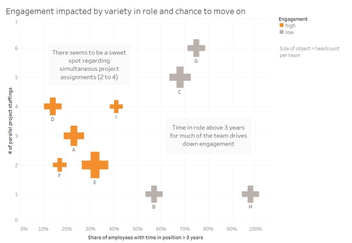
The three metrics that are of interest in this case are number of projects per employee, time in role – and of course the engagement score. Since the latter is not available on an individual basis, we will analyse all three metrics on a team level.
A visual talks to most of us
Since you assume a “link” (or, in more technical terms: a correlation) between the three variables, you could of course calculate the correlation coefficient between the variables, test the statistical significance and communicate these results to your audience (heads scratched, jaws dropped).
Alternatively (and possibly with a higher chance of impact) you (or a more visual savvy colleague) could create a visual that makes the links between the metrics intuitively understandable.
In the example below, two of the metrics (# of project staffings per employee and % of team members with a time in position > 3 years) are shown on the vertical and horizontal axis respectively. The development of the engagement score determines the colour of your symbols – and the size of the symbols is driven by the headcount in each team.
What the data tell us (and what not)
You’ve got a great visual – now there comes the tricky part: the interpretation. You’ve probably heard it a 1000 times – but here it is again – because it’s essential: Correlation is not causation! So please resist the temptation of stating that “the visual shows that engagement is driven by ….”. What we do see is that there seems to be a link between the share of employees in a team who have been in their role for more than 3 years – and the engagement level of that team. You could only find out about causality if you did an experiment where you change the time in role, leave everything else perfectly unchanged (which is pretty impossible in real life) and measure engagement again.
Still, even if multi metric visualizations don’t tell us “what drives what”, they can be a powerful entry point for a discussion with your stakeholder – which will in many cases result in good and reliable ideas about where to start tackling the problem.
Want more?
Want to hear more about how to combine several metrics in your analysis? Interested in alternative ways of visualizing the results of such analysis? Come back and check out the “Post your question” area in this community. One of your HR colleagues might have posted a question regarding to exactly this topic – or otherwise go ahead and post a question yourself.
Also, join us in one of the upcoming “Live Specials” where we will have a highly interactive session on a variety of topics related to working in a data driven way in people management. See you there!


Leave a Reply
Want to join the discussion?Feel free to contribute!